Newspaper Designs
Print design is where reporting and visual storytelling meet. As a Features Editor, I approached every layout with the goal of emphasizing the stories, making them clear and engaging for the reader. These pages came out of long production nights, back-and-forth with writers, and some really fun collaboration with my co-editor Leah! Building the Winged Post as a whole staff together has been an amazing highlight in journalism.
Featured Design
Issue 5 - Page 5
New York, Pleasure Reading, Alternative Transportation
This was our most recent page, and my last page in the 25-26 leadership team. This page was really special to me, because it tested everything I have learned about adapting on the fly. The dominant article was originally supposed to be a different article, but had to be scrapped in the last minute due to unexpected delays.
I came up with the brand new design for the new "Out of the Nest" article for our CSPA trip, and actually designed the entire layout in about three hours while sitting on the plane. Despite the extremely fast turnaround, I was able to get all the copy and designs finished and filled with my photos and submitted quite early, right after our virtual production night.
I also designed the alternative transportation section with the photo and pie chart. I really enjoyed putting that half idea together, especially designing the pie chart over the wheel of the bicycle to break down the data visually. Even though the whole page was a massive sprint, being able to pull it off under the pressure made it the perfect final piece for my term as Features Editor!

Issue 1 - Page 4
New Teachers
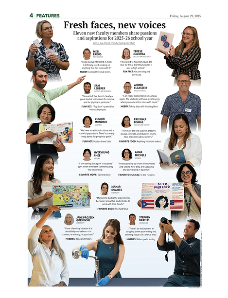
On paper, this page posed quite a challenge: featuring eleven new teachers in a single article! This was a historical number for us compared to previous years' pages, which meant a traditional grid layout wasn't going to work. Instead, I developed an idea of having this interactive design, structured around environmental portraits with pull quotes in the center.
To pull this off, I jumped in to take a lot of the photos and interviews myself, and communicated constantly with other photographers and writers to keep the vision cohesive for the page. Overall, I'm incredibly happy about how this page turned out, because the natural and human poses add a huge layer of energy and personality to the piece.
Issue 2 - Page 5
Wi-Fi rollout, "Clanker"
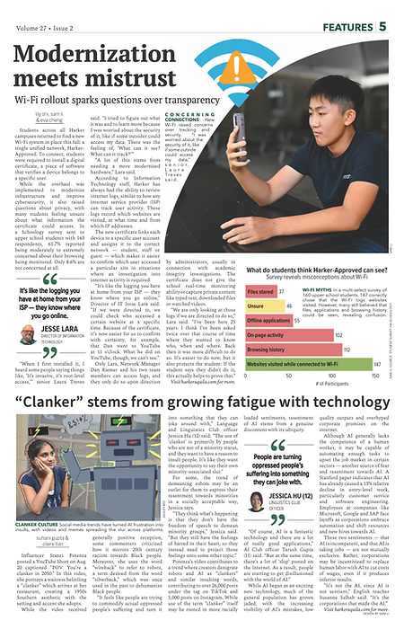
For this page, I wanted to focus on clear storytelling. I took the main portrait and created the Wi-Fi symbol graphic to anchor the top story. I also wanted to make sure the data we discussed in the article was digestible for readers, so I designed a bar chart to convey the numbers more clearly. I also used a dark, almost black background to create a "pop" with the subject. Also, instead of a normal rectangular photo, I also experimented with a curved cutout right into the top corner of the image to create the shape of a Wi-Fi symbol. Then, I drew in a custom symbol with an alert icon to highlight the concerns regarding the new network system.
Moving down to the bottom of the page, I wanted to make sure the "Clanker" article had its own distinct identity. Overall, this page allowed me to combine photography, drawing, designing data, and page architecture in one package.

Issue 3 - Page 5
Local news decline
Though I didn't build the primary illustration for this specific page, I helped direct the artwork, which ended up being one of my favorite collaborative experiences. This story was about the decline of local news, so I wanted to follow an illustrative approach aligning with "news deserts." To have the visuals reflect that barren and dry environment, I pitched the concept of taking a standard data pie chart and turning it into a tumbleweed that seems to roll through the illustration. From there, I worked closely with our illustrator Emma, to establish a clear visual direction. We spent a lot of time bouncing ideas back and forth through lots of drafts, and I learned a lot about how to communicate a vision clearly through this article. A massive thank you to Emma Lee, who did an absolutely amazing job bringing this final illustration together! Our publication gets so much stronger when editors and illustrators are in sync.
Issue 4B - Page 2
Williamson MYSF, New classes
For my first page of the double issue, I was largely involved with reporting and also executing this page. I co-wrote the main feature on Mr. Williamson, which allowed me to have a strong understanding of his story before I took the portrait. He was incredibly enthusiastic during the interview, particularly when discussing his legacy with the advisory program and the bonds he built with students. I wanted the photography to reflect that, so I took a portrait of him smiling while holding his past advisories. I also made sure to capture a photo of him talking to ASB President Luke Wu to highlight his role in student life. Overall, I was able to make sure the photos and layout perfectly matched the tone of the story.
On the bottom half of the page, we needed to highlight two new courses. I wanted to integrate the courses more creatively, so I pitched the concept of embedding the headshots directly into custom illustrations. I communicated that vision to our illustrator, Isabella, and worked closely with her to make sure the graphics fit the layout.


Issue 4B - Page 4
Campus renovations, car feature
I designed this page in collaboration with Leah, and my primary focus was driving the car culture feature on the bottom half. Because I helped write the article, I had a very clear vision of how the visuals needed to support the narrative. The story highlights the intense, hands-on engineering work that goes into car maintenance, and I knew a single picture would not do it justice. I specifically designed a three photo layout to visually walk the reader through Vova's actual process of working on his engine. By capturing him in different stages of inspecting and fixing the car, and finally enter the car, the photos create their own sequential story that anchors the text. Being able to connect the reporting directly to the visual layout like this is exactly the kind of cohesive design I want to encourage as Editor-in-Chief.
Past Issues

